はじめに
前回はFlutter Widget of the Weekの「#70 ShaderMask」、「#71 NotificationListener」、「#72 Builder」を紹介しました。
今回はその続きで「#73 ClipPath」、「#74 CircularProgressIndicator,LinearProgressIndicator」、「#75 Divider」の3つです。
前回の記事はこちら
またGitHubにも公開しています。
GitHub - nobushiueshi/flutter_widget_of_the_week
Contribute to nobushiueshi/flutter_widget_of_the_week development by creating an account on GitHub.
github.com
Flutter Widget of the Week
環境
- Flutter 3.3.0
記事にした時点でのバージョンです。GitHubに公開しているのは常に最新の安定版(stable)を使う予定です。
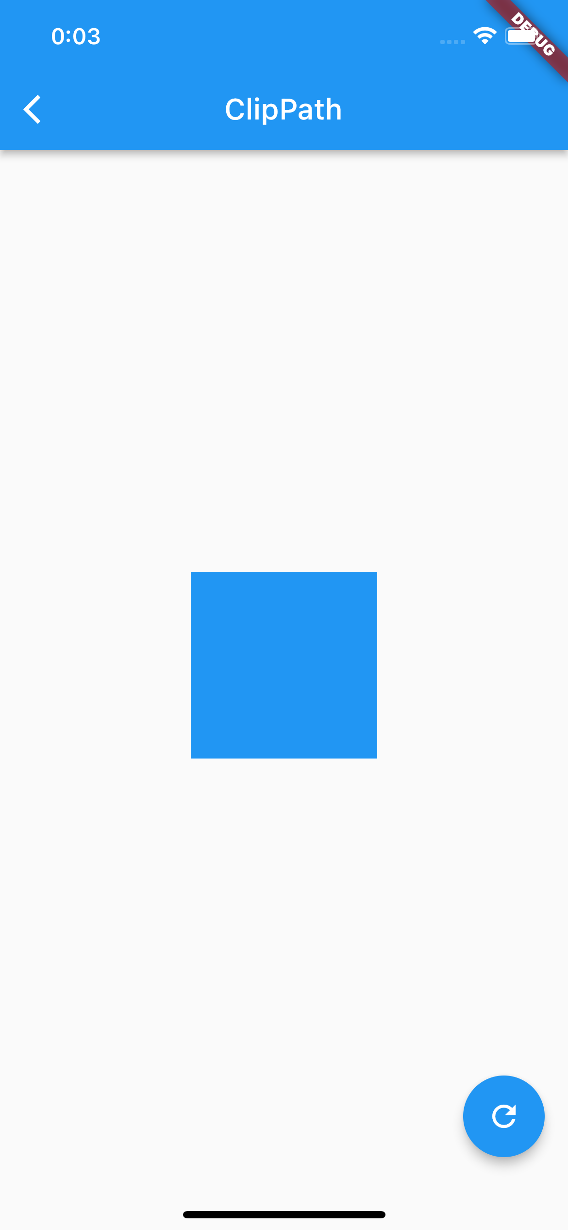
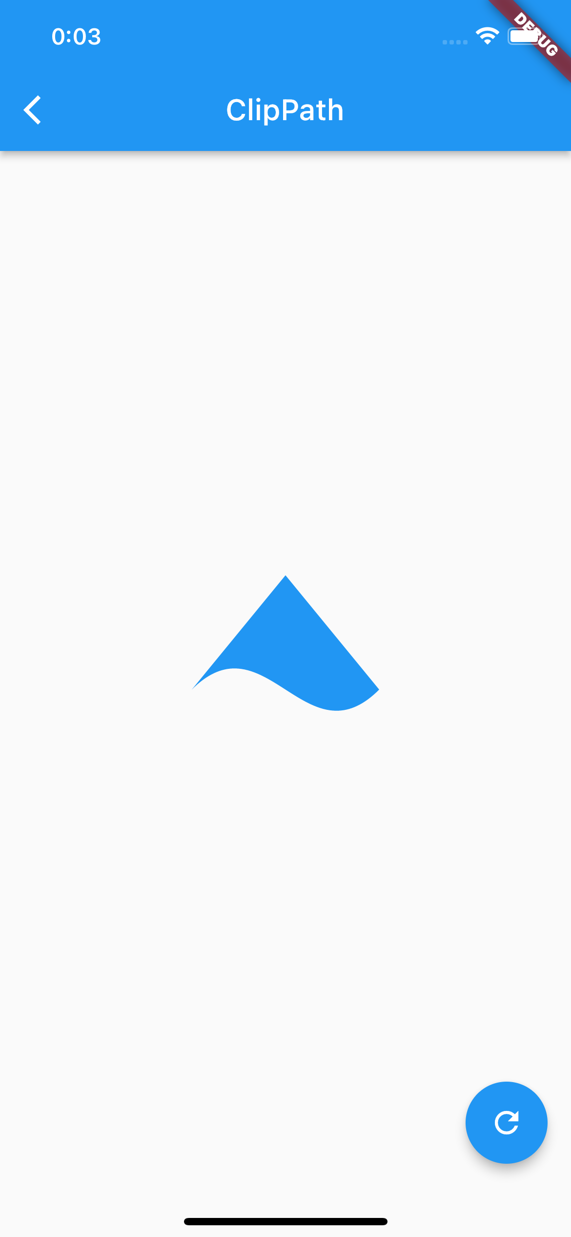
#73ClipPath
ClipPathとは
ウィジェットを自分好みの形にすることができるウィジェットです。
サンプルコード
import 'package:flutter/material.dart';

class SamplePage073 extends StatefulWidget {
  const SamplePage073({
    super.key,
  });

  @override
  State<SamplePage073> createState() => _SamplePage073State();
}

class _SamplePage073State extends State<SamplePage073> {
  var _enableClip = false;

  @override
  Widget build(BuildContext context) {
    return Scaffold(
      appBar: AppBar(
        title: const Text('ClipPath'),
        centerTitle: true,
      ),
      body: SafeArea(
        child: Center(
          child: ClipPath(
            clipper: _enableClip ? _SamplePage073Clipper() : null,
            child: Container(
              width: 128,
              height: 128,
              color: Colors.blue,
            ),
          ),
        ),
      ),
      floatingActionButton: FloatingActionButton(
        onPressed: () {
          setState(() {
            _enableClip = !_enableClip;
          });
        },
        child: const Icon(Icons.refresh),
      ),
    );
  }
}

class _SamplePage073Clipper extends CustomClipper<Path> {
  @override
  Path getClip(Size size) {
    final controlPoint1 = Offset(50, size.height - 100);
    final controlPoint2 = Offset(size.width - 50, size.height);
    final endPoint = Offset(size.width, size.height - 50);

    final path = Path()
      ..moveTo(size.width / 2, 0)
      ..lineTo(0, size.height - 50)
      ..cubicTo(
        controlPoint1.dx,
        controlPoint1.dy,
        controlPoint2.dx,
        controlPoint2.dy,
        endPoint.dx,
        endPoint.dy,
      )
      ..close();

    return path;
  }

  @override
  bool shouldReclip(covariant CustomClipper<Path> oldClipper) => false;
}
結果
動画
公式リファレンス

ClipPath class - widgets library - Dart API
API docs for the ClipPath class from the widgets library, for the Dart programming language.
api.flutter.dev
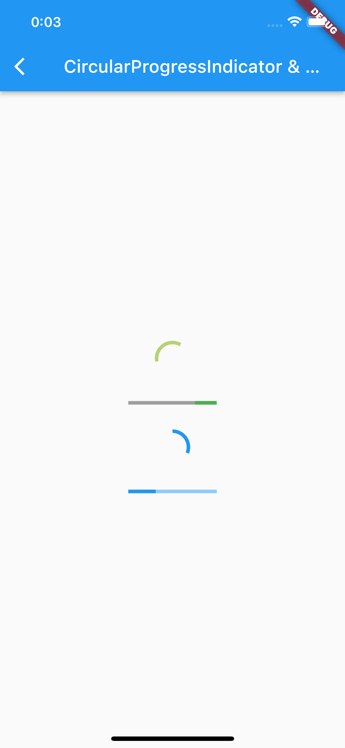
#74 CircularProgressIndicator,LinearProgressIndicator
CircularProgressIndicator,LinearProgressIndicatorとは
進捗状況や実行中であることを示すのにうってつけのウィジェットです。
サンプルコード
import 'package:flutter/material.dart';

class SamplePage074 extends StatefulWidget {
  const SamplePage074({
    super.key,
  });

  @override
  State<SamplePage074> createState() => _SamplePage074State();
}

class _SamplePage074State extends State<SamplePage074>
    with SingleTickerProviderStateMixin {
  late final AnimationController _animationController;

  @override
  void initState() {
    super.initState();

    _animationController = AnimationController(
      duration: const Duration(seconds: 5),
      vsync: this,
    )..repeat();
  }

  @override
  void dispose() {
    _animationController.dispose();
    super.dispose();
  }

  @override
  Widget build(BuildContext context) {
    return Scaffold(
      appBar: AppBar(
        title: const Text(
          'CircularProgressIndicator & LinearProgressIndicator',
        ),
        centerTitle: true,
      ),
      body: SafeArea(
        child: Center(
          child: Column(
            mainAxisAlignment: MainAxisAlignment.center,
            children: [
              const SizedBox(height: 30),
              CircularProgressIndicator(
                valueColor: _animationController.drive(
                  ColorTween(
                    begin: Colors.yellow,
                    end: Colors.blue,
                  ),
                ),
              ),
              const SizedBox(height: 30),
              const SizedBox(
                width: 100,
                child: LinearProgressIndicator(
                  valueColor: AlwaysStoppedAnimation<Color>(Colors.green),
                  backgroundColor: Colors.grey,
                ),
              ),
              const SizedBox(height: 30),
              TweenAnimationBuilder<double>(
                duration: const Duration(seconds: 5),
                tween: Tween<double>(
                  begin: 0,
                  end: 1,
                ),
                builder: (context, value, child) {
                  return Column(
                    children: [
                      CircularProgressIndicator(
                        value: value,
                      ),
                      const SizedBox(height: 30),
                      SizedBox(
                        width: 100,
                        child: LinearProgressIndicator(
                          value: value,
                        ),
                      ),
                    ],
                  );
                },
              ),
            ],
          ),
        ),
      ),
    );
  }
}
結果
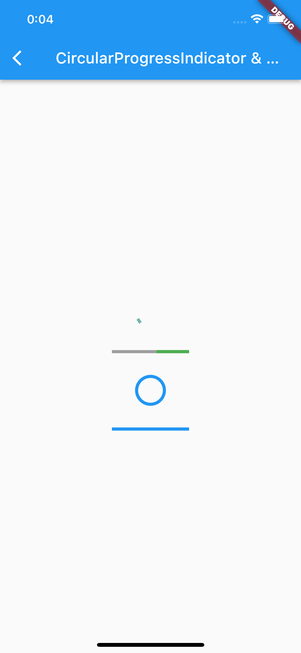
動画
公式リファレンス

CircularProgressIndicator class - material library - Dart API
API docs for the CircularProgressIndicator class from the material library, for the Dart programming language.
api.flutter.dev

LinearProgressIndicator class - material library - Dart API
API docs for the LinearProgressIndicator class from the material library, for the Dart programming language.
api.flutter.dev
#75 Divider
Dividerとは
区切り線のウィジェットです。
サンプルコード
import 'package:flutter/material.dart';

class SamplePage075 extends StatelessWidget {
  const SamplePage075({
    super.key,
  });

  @override
  Widget build(BuildContext context) {
    return Scaffold(
      appBar: AppBar(
        title: const Text('Divider'),
        centerTitle: true,
      ),
      body: SafeArea(
        child: SingleChildScrollView(
          child: Column(
            mainAxisSize: MainAxisSize.min,
            children: [
              const FlutterLogo(
                size: 64,
              ),
              const Divider(),
              const FlutterLogo(
                size: 64,
              ),
              const Divider(
                color: Colors.blue,
                indent: 20,
                endIndent: 20,
                thickness: 5,
              ),
              ListView(
                shrinkWrap: true,
                children: ListTile.divideTiles(
                  context: context,
                  color: Colors.yellow,
                  tiles: List.generate(
                    3,
                    (index) => ListTile(
                      title: Text('ListTile.divideTiles : $index'),
                    ),
                  ),
                ).toList(),
              ),
              const Divider(),
              ListView.separated(
                shrinkWrap: true,
                itemBuilder: (context, index) {
                  return ListTile(
                    title: Text('ListView.separated : $index'),
                  );
                },
                separatorBuilder: (context, index) {
                  return const Divider(
                    color: Colors.red,
                  );
                },
                itemCount: 3,
              ),
            ],
          ),
        ),
      ),
    );
  }
}
結果
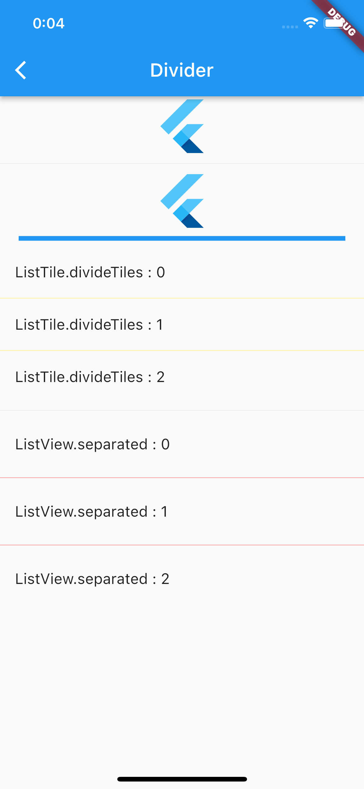
動画
公式リファレンス

Divider class - material library - Dart API
API docs for the Divider class from the material library, for the Dart programming language.
api.flutter.dev
さいごに
ClipPath、難しい。。。
おすすめ参考書
リンク
GitHub - nobushiueshi/flutter_widget_of_the_week
Contribute to nobushiueshi/flutter_widget_of_the_week development by creating an account on GitHub.
github.com
コメント