はじめに
ユーザーに任意の色を選択させたい場合に専用のUIをわざわざ作成するのは億劫です。そんなときに便利な使えそうなプラグインを見つけたので紹介します。
環境
- Flutter 1.22.6
- flutter_colorpicker 0.3.5
実装方法
プラグインの最新バージョンを確認
下記のサイトにアクセスし、バージョンを確認します。

flutter_colorpicker | Flutter package
HSV(HSB)/HSL/RGB/Material color picker inspired by all the good design for your amazing flutter apps.
pub.dev
記事作成の時点では0.3.5が最新バージョンでした。
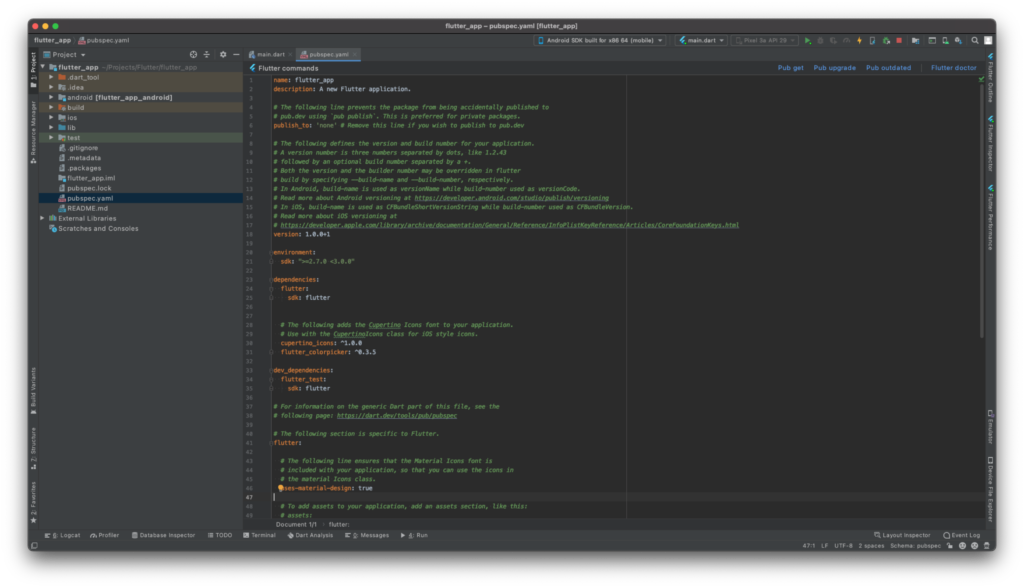
プラグインのインストール
pubspec.yamlのdependenciesに「flutter_colorpicker: ^0.3.5」を追記します。
dependencies:
  flutter:
    sdk: flutter


  # The following adds the Cupertino Icons font to your application.
  # Use with the CupertinoIcons class for iOS style icons.
  cupertino_icons: ^1.0.0
  flutter_colorpicker: ^0.3.5
その後、プロジェクト配下で「flutter pub get」コマンドを実行します。
よくわからない場合はAndroid Studioでpubspec.yamlファイルを開くと右上に「Pub get」ボタンがあるのでそれを押してください。
これでプラグインのインストールは完了です。
サンプルコード
import 'package:flutter/material.dart';
import 'package:flutter_colorpicker/flutter_colorpicker.dart';

void main() {
  runApp(MyApp());
}

class MyApp extends StatelessWidget {
  @override
  Widget build(BuildContext context) {
    return MaterialApp(
      title: 'Flutter Demo',
      theme: ThemeData(
        primarySwatch: Colors.blue,
        visualDensity: VisualDensity.adaptivePlatformDensity,
      ),
      home: MyHomePage(title: 'Flutter Demo Home Page'),
    );
  }
}

class MyHomePage extends StatefulWidget {
  MyHomePage({Key key, this.title}) : super(key: key);

  final String title;

  @override
  _MyHomePageState createState() => _MyHomePageState();
}

class _MyHomePageState extends State<MyHomePage> {
  Color selectedColor = Colors.blue;
  Color pickerColor = Colors.blue;

  void _changeColor(Color color) {
    pickerColor = color;
  }

  void _showPicker(BuildContext context) {
    showDialog(
      context: context,
      child: AlertDialog(
        title: const Text('Pick a color!'),
        content: SingleChildScrollView(
          child: ColorPicker(
            pickerColor: pickerColor,
            onColorChanged: _changeColor,
            showLabel: true,
            pickerAreaHeightPercent: 0.8,
          ),
        ),
        actions: <Widget>[
          FlatButton(
            child: const Text('Got it'),
            onPressed: () {
              setState(() => selectedColor = pickerColor);
              Navigator.of(context).pop();
            },
          ),
        ],
      ),
    );
  }

  @override
  Widget build(BuildContext context) {
    return Scaffold(
      appBar: AppBar(
        title: Text(widget.title),
        backgroundColor: selectedColor,
      ),
      body: Center(
        child: Column(
          mainAxisAlignment: MainAxisAlignment.center,
          children: <Widget>[
            Text(
              'You have pushed the button this many times:',
            ),
          ],
        ),
      ),
      floatingActionButton: FloatingActionButton(
        onPressed: () {
          _showPicker(context);
        },
        child: Icon(Icons.color_lens),
      ),
    );
  }
}
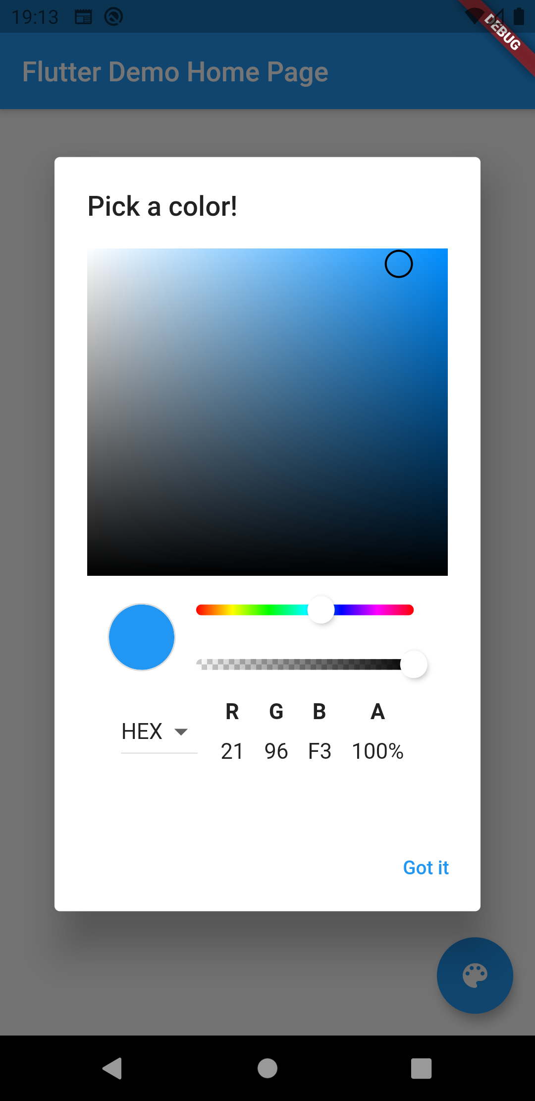
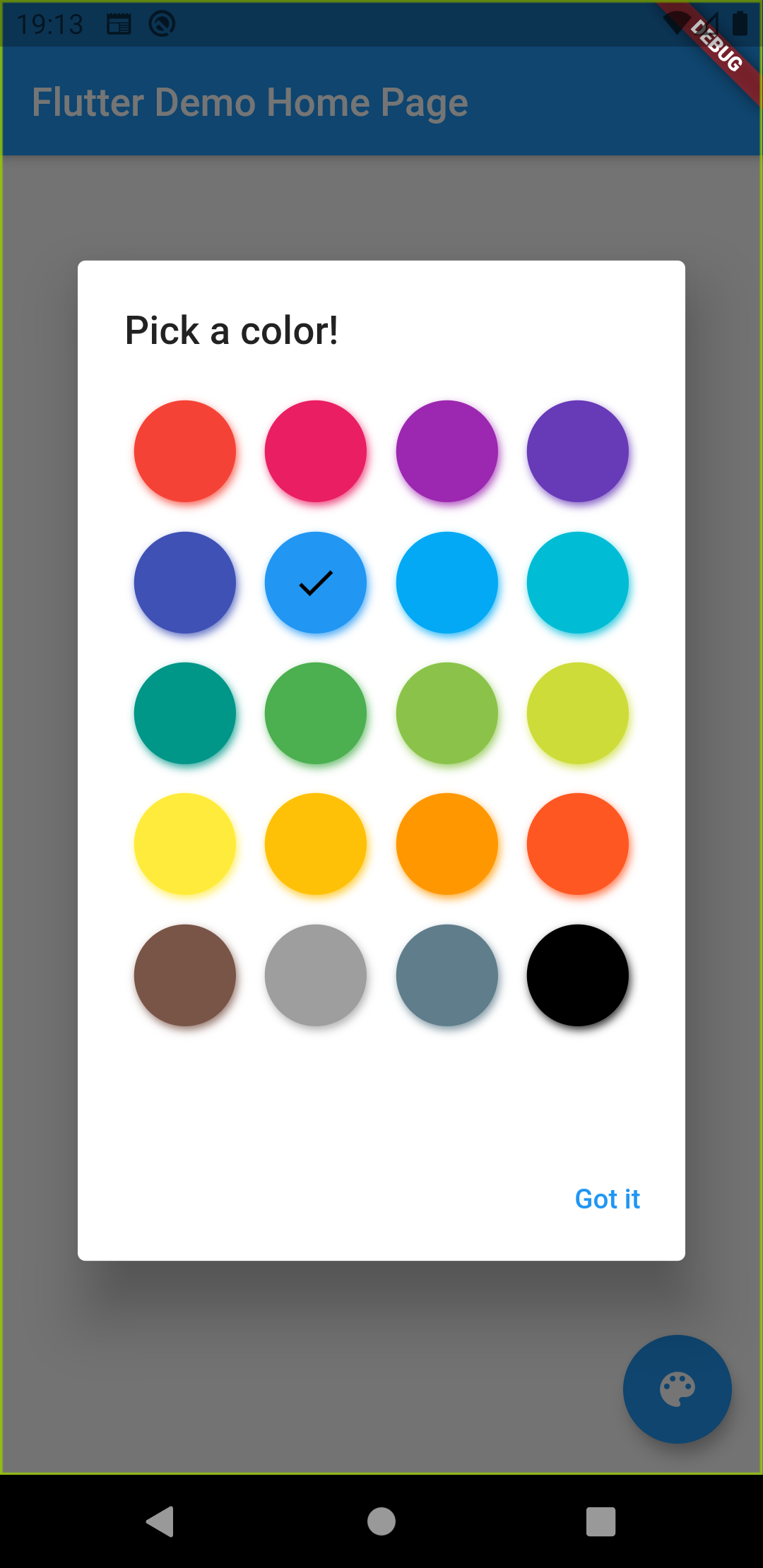
実行結果
使い勝手な良さそうなカラーピッカーが無事表示されました。
その他のデザイン
さらにこのプラグインは上記のデザイン以外に色々なものがあります。
MaterialPicker
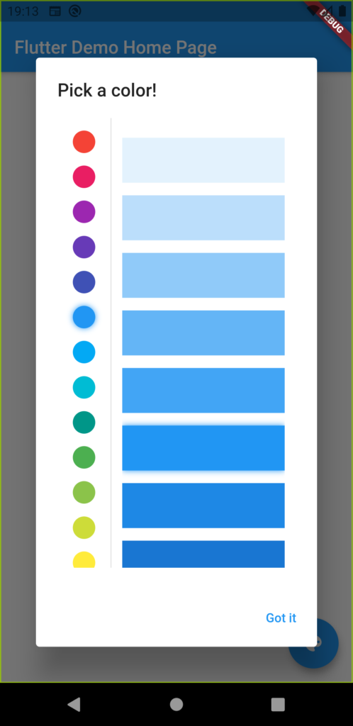
BlockPicker
MultipleChoiceBlockPicker
BlockPickerの複数選択版などもあります。

紹介した以外にもいくつかデザインやRGB選択じゃなく、HSV選択のピッカーもあるようです。
さいごに
今の所、色を選択するような機会はないんですが、無駄にリッチなので、どうにかして自作アプリで使えないかと考えています。
コメント