はじめに
前回はFlutter Widget of the Weekの「#76 IgnorePointer」、「#77 CupertinoActivityIndicator」、「#78 ClipOval」を紹介しました。
今回はその続きで「#79 AnimatedWidget」、「#80 Padding」、「#81 CheckboxListTile」の3つです。
前回の記事はこちら
またGitHubにも公開しています。
GitHub - nobushiueshi/flutter_widget_of_the_week
Contribute to nobushiueshi/flutter_widget_of_the_week development by creating an account on GitHub.
github.com
Flutter Widget of the Week
環境
- Flutter 3.3.2
記事にした時点でのバージョンです。GitHubに公開しているのは常に最新の安定版(stable)を使う予定です。
#79 AnimatedWidget
AnimatedWidgetとは
ウィジェットにアニメーションを簡単に付けることができます。アニメーションを付ける方法は数多くありますが、大抵の場合はこのウィジェットを使えばカバーできます。
サンプルコード
import 'package:flutter/material.dart';

class SamplePage079 extends StatefulWidget {
  const SamplePage079({
    super.key,
  });

  @override
  State<SamplePage079> createState() => _SamplePage079State();
}

class _SamplePage079State extends State<SamplePage079>
    with SingleTickerProviderStateMixin {
  late final AnimationController _animationController;

  @override
  void initState() {
    super.initState();
    _animationController = AnimationController(
      vsync: this,
      duration: const Duration(seconds: 5),
    )..repeat();
    Tween<double>(
      begin: 1,
      end: 100,
    ).animate(_animationController);
  }

  @override
  void dispose() {
    _animationController.dispose();
    super.dispose();
  }

  @override
  Widget build(BuildContext context) {
    return Scaffold(
      appBar: AppBar(
        title: const Text('AnimatedWidget'),
        centerTitle: true,
      ),
      body: SafeArea(
        child: Center(
          child: _SamplePage079ButtonTransition(
            width: _animationController,
          ),
        ),
      ),
    );
  }
}

class _SamplePage079ButtonTransition extends AnimatedWidget {
  const _SamplePage079ButtonTransition({
    required Animation<double> width,
  }) : super(listenable: width);

  Animation<double> get _width => listenable as Animation<double>;

  @override
  Widget build(BuildContext context) {
    return OutlinedButton(
      onPressed: () {},
      style: OutlinedButton.styleFrom(
        side: BorderSide(width: _width.value),
      ),
      child: const Text('Click Me!'),
    );
  }
}
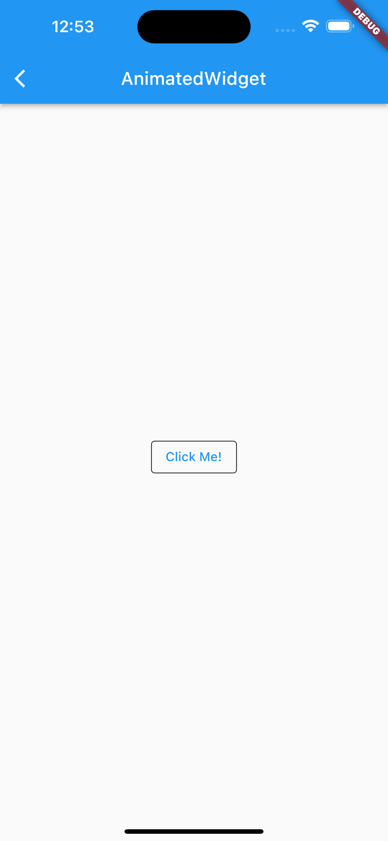
結果
分かりづらいですが、ボタンの枠線の太さがアニメーションしてます。

動画
公式リファレンス

AnimatedWidget class - widgets library - Dart API
API docs for the AnimatedWidget class from the widgets library, for the Dart programming language.
api.flutter.dev
#80 Padding
Paddingとは
子ウィジェットの一部、あるいは全ての境界にパディングや余白を追加できるウィジェットです。
サンプルコード
import 'package:flutter/material.dart';

class SamplePage080 extends StatelessWidget {
  const SamplePage080({
    super.key,
  });

  @override
  Widget build(BuildContext context) {
    return Scaffold(
      appBar: AppBar(
        title: const Text('Padding'),
        centerTitle: true,
      ),
      body: SafeArea(
        child: Center(
          child: Column(
            mainAxisAlignment: MainAxisAlignment.center,
            children: [
              const Center(
                child: Text('Paddingなし'),
              ),
              _SamplePage080ColorBox(
                color: Colors.blue.shade900,
                scale: 3,
              ),
              Row(
                mainAxisAlignment: MainAxisAlignment.center,
                children: [
                  _SamplePage080ColorBox(
                    color: Colors.blue.shade500,
                  ),
                  _SamplePage080ColorBox(
                    color: Colors.yellow.shade700,
                  ),
                  const _SamplePage080ColorBox(
                    color: Colors.grey,
                  ),
                ],
              ),
              const _SamplePage080ColorBox(
                color: Colors.lightBlue,
                scale: 3,
              ),
              const SizedBox(height: 30),
              const Center(
                child: Text('Paddingあり'),
              ),
              Padding(
                padding: const EdgeInsets.all(8),
                child: _SamplePage080ColorBox(
                  color: Colors.blue.shade900,
                  scale: 3,
                ),
              ),
              Row(
                mainAxisAlignment: MainAxisAlignment.center,
                children: [
                  Padding(
                    padding: const EdgeInsets.all(8),
                    child: _SamplePage080ColorBox(
                      color: Colors.blue.shade500,
                    ),
                  ),
                  Padding(
                    padding: const EdgeInsets.all(8),
                    child: _SamplePage080ColorBox(
                      color: Colors.yellow.shade700,
                    ),
                  ),
                  const Padding(
                    padding: EdgeInsets.all(8),
                    child: _SamplePage080ColorBox(
                      color: Colors.grey,
                    ),
                  ),
                ],
              ),
              const Padding(
                padding: EdgeInsets.all(8),
                child: _SamplePage080ColorBox(
                  color: Colors.lightBlue,
                  scale: 3,
                ),
              ),
            ],
          ),
        ),
      ),
    );
  }
}

class _SamplePage080ColorBox extends StatelessWidget {
  const _SamplePage080ColorBox({
    this.color = Colors.blue,
    this.scale = 1.0,
  });

  final Color color;
  final double scale;

  @override
  Widget build(BuildContext context) {
    return ColoredBox(
      color: color,
      child: SizedBox(
        height: 64,
        width: 64 * scale,
      ),
    );
  }
}
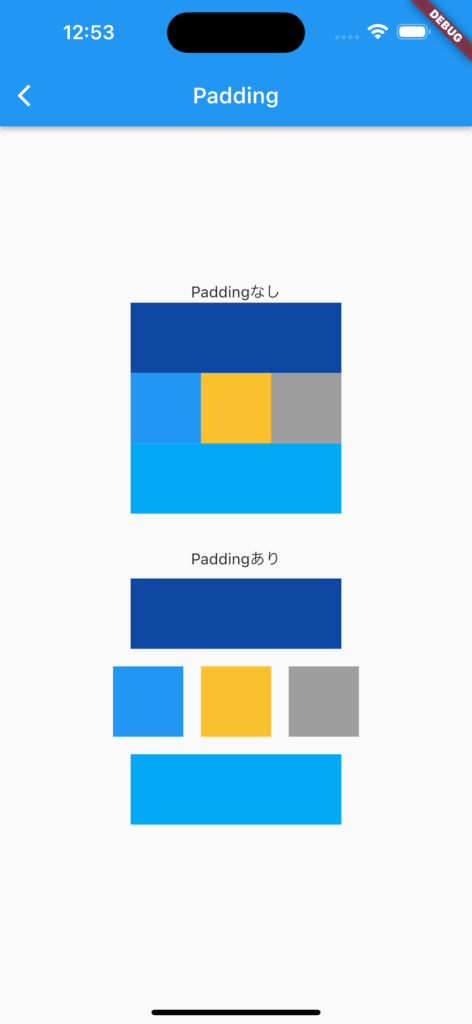
結果
動画
公式リファレンス

Padding class - widgets library - Dart API
API docs for the Padding class from the widgets library, for the Dart programming language.
api.flutter.dev
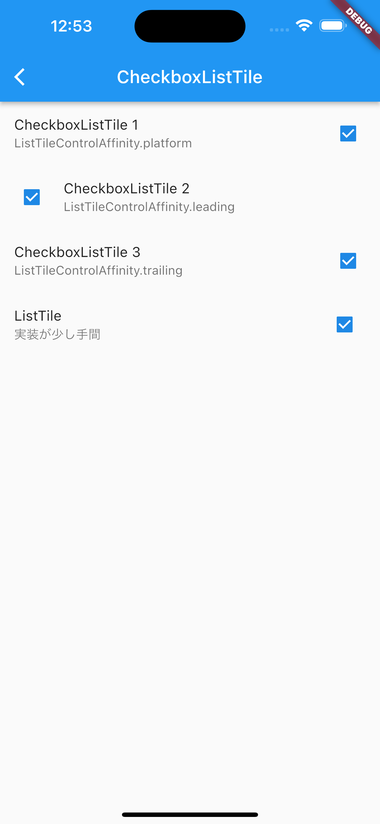
#81 CheckboxListTile
CheckboxListTileとは
名前の通り、ListTileにCheckboxがついたウィジェットです。
ListTileとCheckboxを使って作れば良いのでは?と思うかもしれませんが、タップした時の挙動が違うなどより便利になっています。
サンプルコード
import 'package:flutter/material.dart';

class SamplePage081 extends StatefulWidget {
  const SamplePage081({
    super.key,
  });

  @override
  State<SamplePage081> createState() => _SamplePage081State();
}

class _SamplePage081State extends State<SamplePage081> {
  final List<bool> _values = [
    false,
    false,
    false,
    false,
  ];

  @override
  Widget build(BuildContext context) {
    return Scaffold(
      appBar: AppBar(
        title: const Text('CheckboxListTile'),
        centerTitle: true,
      ),
      body: SafeArea(
        child: ListView(
          children: [
            CheckboxListTile(
              title: const Text('CheckboxListTile 1'),
              subtitle: const Text('ListTileControlAffinity.platform'),
              value: _values[0],
              onChanged: (value) {
                setState(() {
                  _values[0] = value ?? false;
                });
              },
            ),
            CheckboxListTile(
              title: const Text('CheckboxListTile 2'),
              subtitle: const Text('ListTileControlAffinity.leading'),
              controlAffinity: ListTileControlAffinity.leading,
              value: _values[1],
              onChanged: (value) {
                setState(() {
                  _values[1] = value ?? false;
                });
              },
            ),
            CheckboxListTile(
              title: const Text('CheckboxListTile 3'),
              subtitle: const Text('ListTileControlAffinity.trailing'),
              controlAffinity: ListTileControlAffinity.trailing,
              value: _values[2],
              onChanged: (value) {
                setState(() {
                  _values[2] = value ?? false;
                });
              },
            ),
            ListTile(
              title: const Text('ListTile'),
              subtitle: const Text('実装が少し手間'),
              trailing: Checkbox(
                value: _values[3],
                onChanged: (value) {
                  setState(() {
                    _values[3] = value ?? false;
                  });
                },
              ),
              onTap: () {
                setState(() {
                  _values[3] = !_values[3];
                });
              },
            ),
          ],
        ),
      ),
    );
  }
}
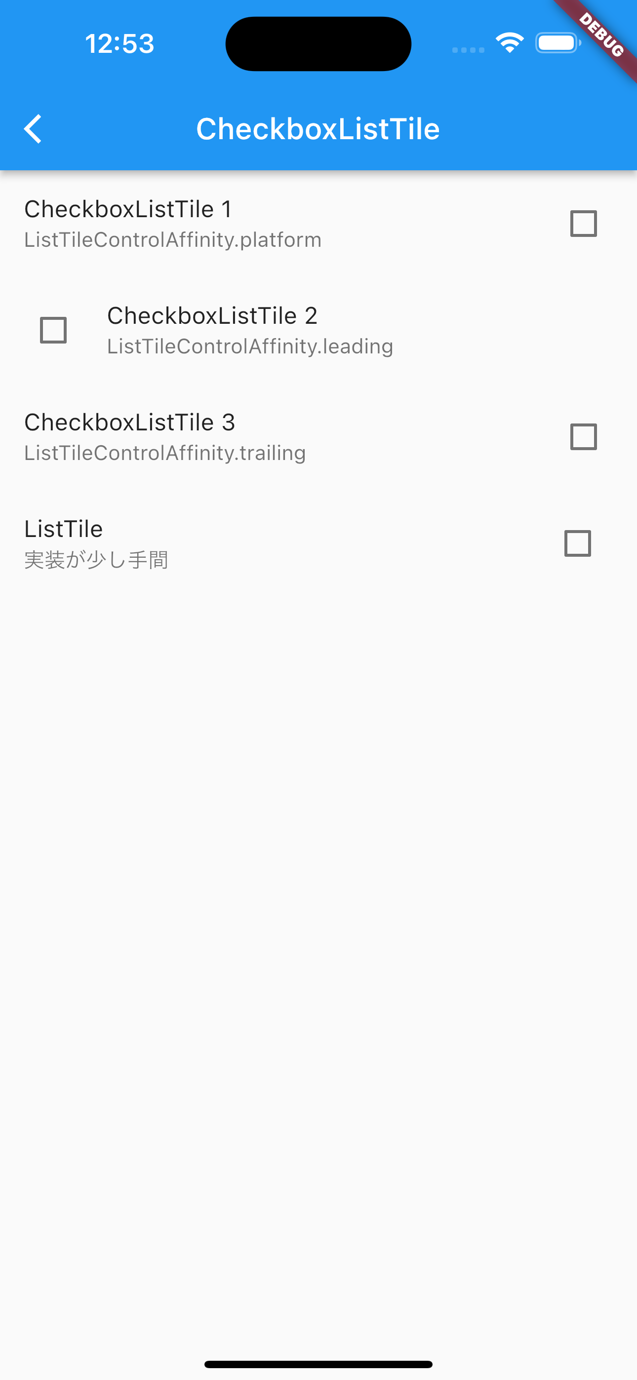
結果
動画
公式リファレンス

CheckboxListTile class - material library - Dart API
API docs for the CheckboxListTile class from the material library, for the Dart programming language.
api.flutter.dev
さいごに
このシリーズ、終りが見えない。。。
おすすめ参考書
リンク
GitHub - nobushiueshi/flutter_widget_of_the_week
Contribute to nobushiueshi/flutter_widget_of_the_week development by creating an account on GitHub.
github.com
コメント